Skip to content
Finluxy
Finluxy
  • Affluent Living
  • Income Reality
  • Life & Money
  • Luxury Spending
  • Real Estate
  • Smart Spending
  • Tax & Wealth

Buy vs. Rent

The conventional wisdom that buying is always better than renting is one of the most persistent and consequential misconceptions in personal finance. The actual math depends on price-to-rent ratios, expected holding period, investment return assumptions, transaction costs, and local market dynamics — and in many high-cost markets at various points in the cycle, renting is the financially superior choice for buyers with a holding period under five to seven years.

The price-to-rent ratio is the starting point. Divide a home’s purchase price by its annual rental equivalent — if a $2 million home would rent for $8,000 per month ($96,000 annually), the price-to-rent ratio is approximately 21. Ratios below 15 generally favor buying; ratios above 20 generally favor renting for shorter holding periods. In San Francisco, New York, and Los Angeles, price-to-rent ratios regularly exceed 25–35, which shifts the math meaningfully toward renting even after tax benefits are factored in.

Transaction costs are the buy-side variable that most calculations underweight. Buying costs — agent commissions, title insurance, mortgage origination, closing costs — typically run 3–5% of the purchase price. Selling costs add another 5–6%. Together, round-trip transaction costs on a $2 million home can exceed $200,000. Recovering that cost in appreciation requires either significant price appreciation or a long enough holding period to amortize it — typically five to seven years at normal appreciation rates.

For households who have settled on buying, the next questions live in first home for primary residence decisions, or second homes for vacation property analysis. The opportunity cost logic here also applies to luxury rentals, where the premium rental market sometimes offers flexibility that justifies the premium. The full real estate cost picture lives in the Real Estate pillar.
Two financial professionals in suits compare distinct geometric data visualizations representing Fannie Mae and MBA mortgage forecasts amidst rising arrows and houses.

2026 Mortgage Rate Forecast: Fannie Mae vs. MBA Data

Geometric vector illustration of a stylized NYC skyline with real estate elements, featuring the headline "Buy vs Rent in NYC".

Buy vs Rent in NYC: Break-Even Math (2026)

Geometric vector illustration comparing renting an apartment versus buying a house, with a three-year calendar icon and modern finance branding.

Rent vs Buy for High Earners Moving in 3 Years

Geometric illustration comparing buying and renting a home in a city, with the title "Buy vs Rent at $100k Income by City."

Buy vs Rent at $100k Income: 10-City Data (2026)

Geometric illustration of a man relaxing in a modern apartment beside a headline about renting at a $120k income.

When Renting Is the Smarter Move at $120k Income

Geometric vector illustration comparing home buying and renting options with an Austin skyline background, featuring the headline "Buy vs Rent in Austin After 2020 Surge."

Buy vs Rent in Austin After 2020 Surge

Geometric vector illustration comparing buying and renting in Chicago, featuring a skyline, balance scale, and "Finluxy.com" text.

Chicago Buy vs Rent: Break-Even Timeline

Geometric vector graphic comparing houses and apartment buildings with palm leaves, titled "Buying vs Renting in Miami" with Finluxy.com at the bottom.

Miami Buy vs Rent: What 2026 Rates Change

Geometric vector illustration for a finance blog titled "Renting Luxury," showing a modern building, premium car, and mortgage documents.

Renting Luxury: When It Makes More Financial Sense

Geometric vector illustration comparing home buying and renting in San Francisco, featuring a Victorian house and green growth arrows.

San Francisco Buy vs Rent: When Buying Wins

Geometric vector graphic comparing renting an apartment versus buying a house on a balance scale, featuring the headline and website URL.

$350k Home on $100k Income: Full Rent vs Buy Math

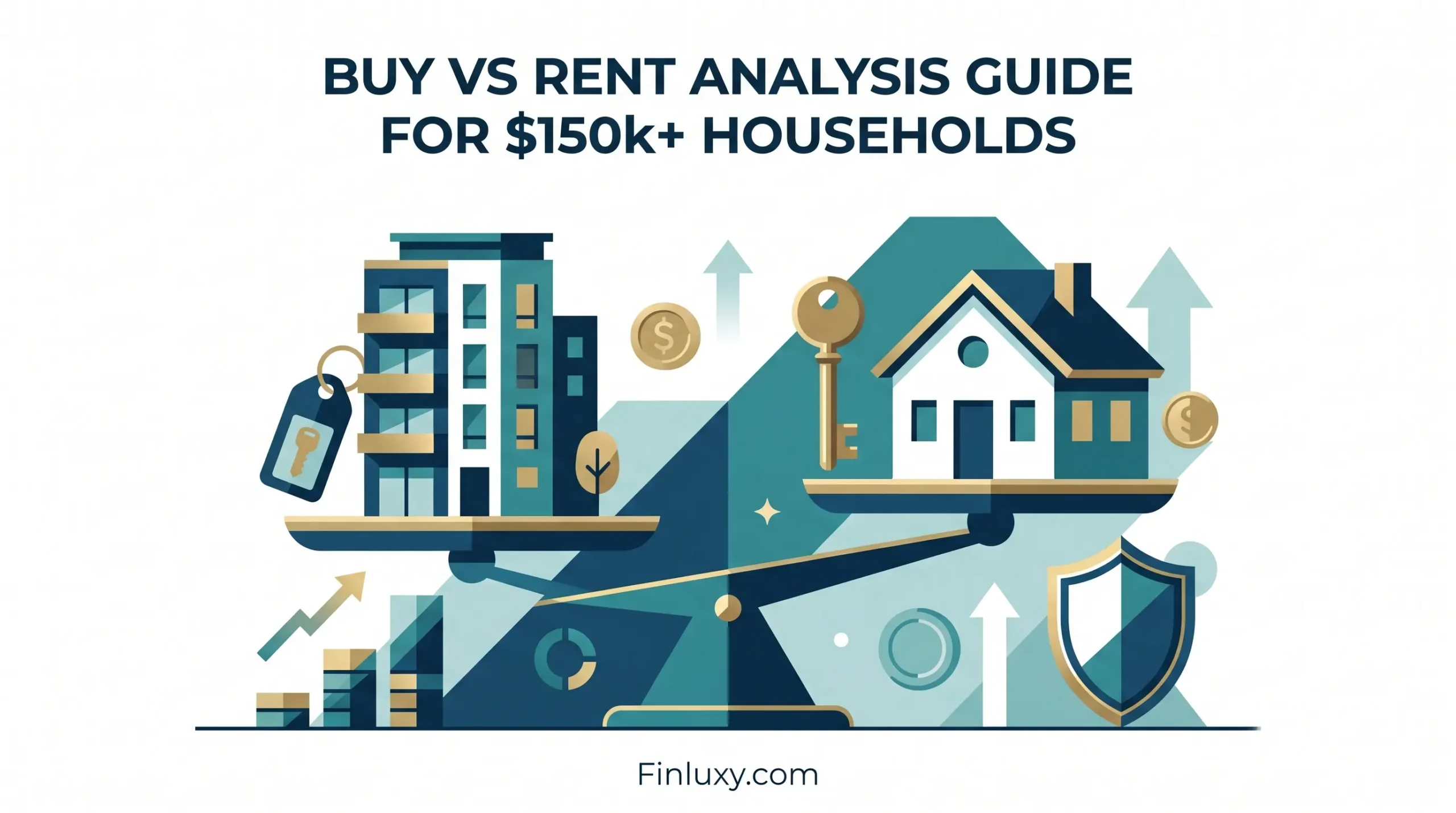
Geometric illustration of a balance scale weighing an apartment against a house, representing the buy versus rent decision.

Buy vs Rent Analysis Guide for $150k+ Households

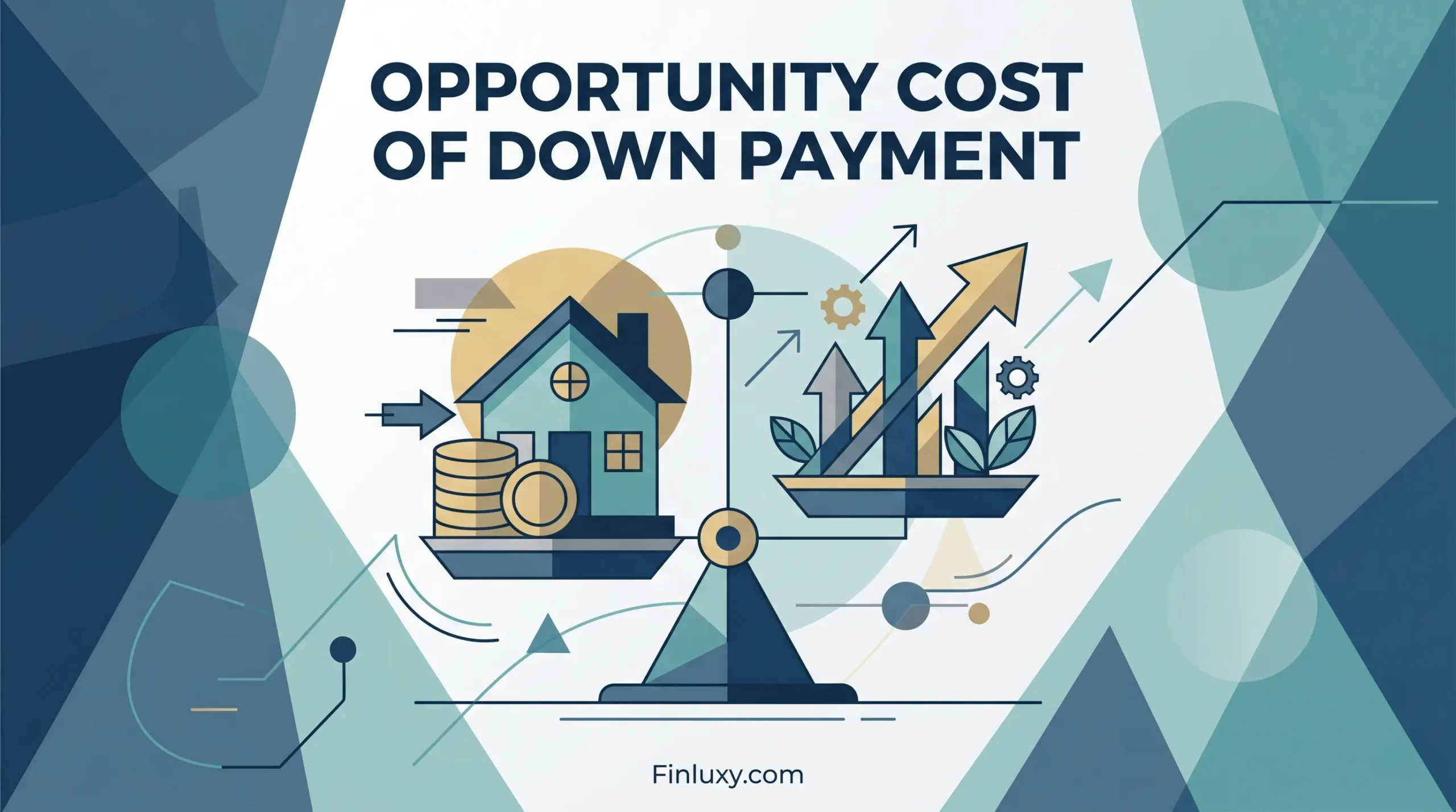
Geometric illustration showing a balance scale weighing a house with coins against growth arrows, titled 'Opportunity Cost of Down Payment'.

Opportunity Cost of Down Payment: The Real Number

Geometric vector illustration comparing a house and an apartment building with arrows and percentage signs, for Finluxy.com.

Interest Rate Impact on Buy vs Rent Decision

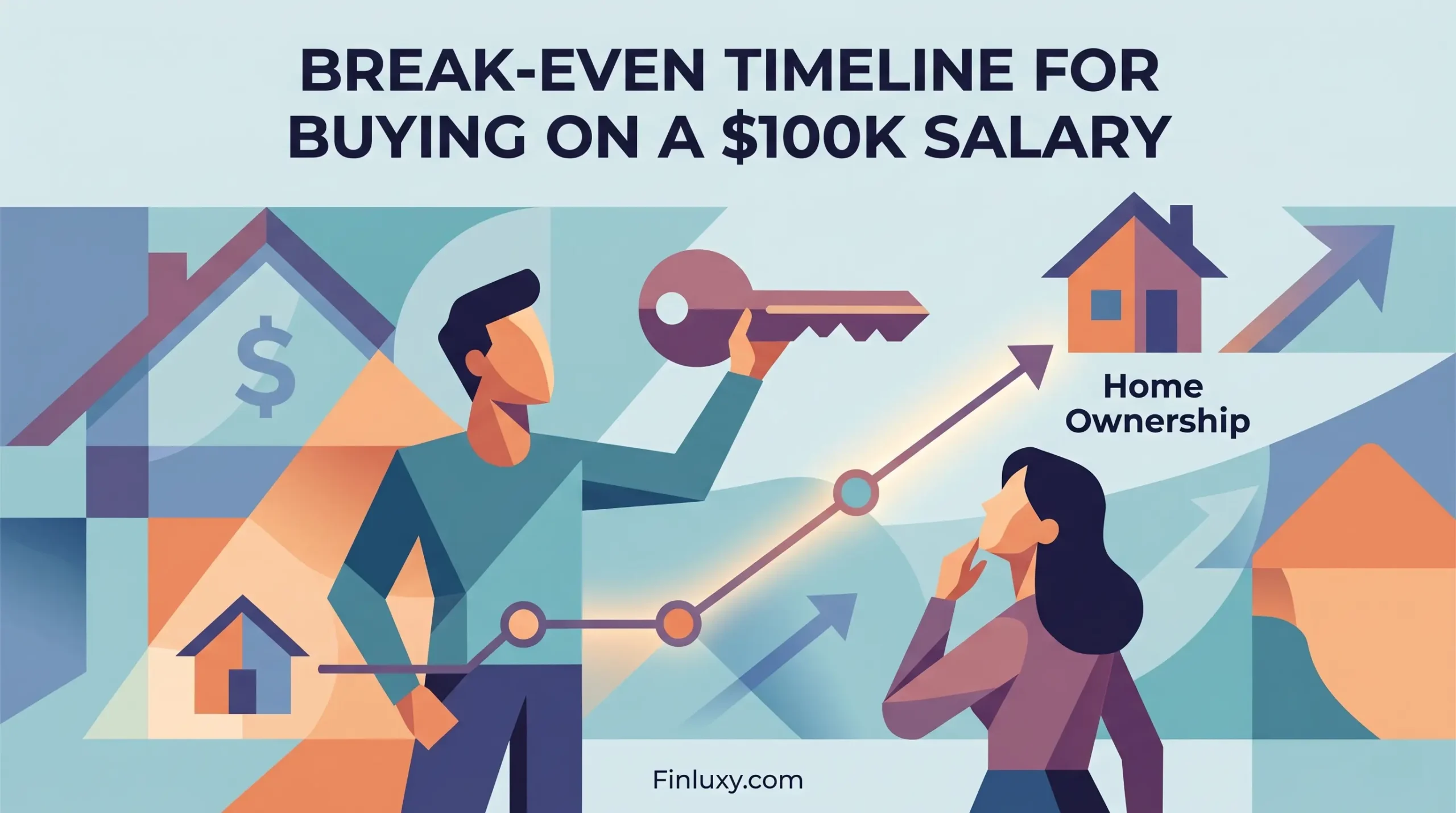
Geometric vector illustration of a couple planning for home ownership, featuring a rising arrow timeline, a key, and house icons.

Break-Even Timeline for Buying on a $100k Salary

Geometric vector illustration balancing a house and keys on a scale, comparing renting versus buying a one million dollar property.

Renting vs Buying at $1M Price Point: Full Math

Geometric vector illustration of a house key, tax form, and coins, with the headline "Tax Benefit of Homeownership."

Tax Benefit of Homeownership: Real Dollar Value

  • About
  • Privacy Policy
  • Editorial Policy
  • Disclaimer
  • Affiliate Disclosure
  • Terms of Use
  • Contact
© 2026 Finluxy. All Rights Reserved.