Skip to content
Finluxy
Finluxy
  • Affluent Living
  • Income Reality
  • Life & Money
  • Luxury Spending
  • Real Estate
  • Smart Spending
  • Tax & Wealth

Neighborhood Data

Neighborhoods are where city-level real estate analysis breaks down into the data that actually matters for a purchase decision. Two blocks can represent a $500,000 price difference, meaningfully different school assignments, opposite crime trends, and entirely different day-to-day living experiences. For buyers making a decision at the $1 million+ level, getting the neighborhood analysis right is worth more effort than most buyers invest.

School data is the most widely cited neighborhood variable, but it’s also the most misused. State rankings and GreatSchools scores are widely available but capture a snapshot of a school’s performance at a moment in time, not its trajectory. Reviewing multiple years of test score data, demographic shifts, and administrative stability gives a more reliable picture of where a school district is heading than any single rating. For buyers without children, school quality still matters because it’s among the strongest predictors of neighborhood property value stability.

Price trend data by neighborhood — rather than by city or zip code — is the variable that serious buyers examine most carefully. Markets within a city can be in fundamentally different stages of their cycle simultaneously. A neighborhood with strong price appreciation over the past five years driven by new commercial development, transit investment, or demographic shift may offer better risk-adjusted upside than a neighborhood that has already repriced. Redfin, Zillow’s neighborhood data tools, and local MLS data all provide price per square foot trends that repay careful study.

Crime trend data, walkability scores, noise level, flood zone status, and planned development in surrounding areas each carry financial implications that affect both quality of life and long-term property value. For buyers comparing specific neighborhoods across cities, city comparisons provides the macro framework that neighborhood analysis sits within. The Real Estate pillar covers the full set of variables that determine what a property is worth and what it costs to own.

A vector illustration of a person examining a digital map of a neighborhood through a magnifying glass, analyzing real estate data.

Neighborhood Data Guide for Premium Home Buyers

A geometric vector illustration shows a rising bar chart transforming into a city skyline with houses and currency icons, representing real estate appreciation. The text "Austin Neighborhood Appreciation Since 2020: Data" is at the top, and "Finluxy.com" is at the bottom.

Austin Neighborhood Appreciation Since 2020: Data

Geometric vector illustration of stylized city buildings and rising arrows, alongside the title "Price Per Square Foot by Neighborhood: NYC Data."

Price Per Square Foot by Neighborhood: NYC Data

A geometric illustration contrasting security symbols and cityscapes on the left with houses and money bags on the right.

Crime Index vs Home Price: What the Data Shows

Modern geometric illustration of a Los Angeles map with an upward arrow highlighting neighborhood real estate appreciation.

Best-Appreciated Neighborhoods in LA (5-Year Data)

Geometric vector illustration visualizing neighborhood real estate data, with abstract houses, dollar signs, and measurement icons for price-per-square-foot analysis.

How to Read Neighborhood Price-Per-Sqft Data

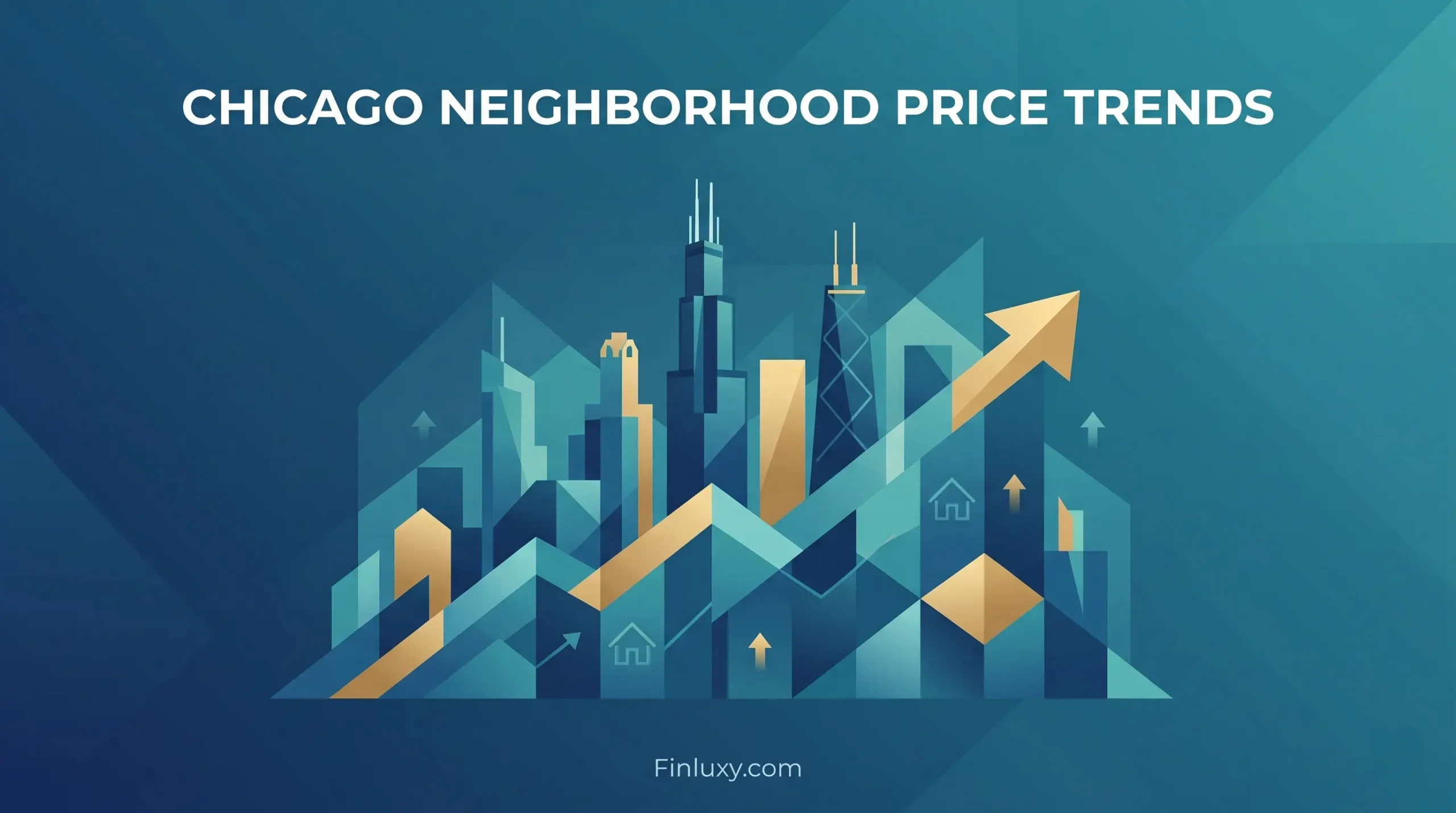
Geometric vector illustration of Chicago skyline with upward arrows and house icons, representing real estate price trends.

Chicago Neighborhood Price Trends: 5-Year Review

Modern vector illustration of the Miami skyline at sunset with palm trees and a rising growth arrow.

Top-Appreciating Neighborhoods in Miami

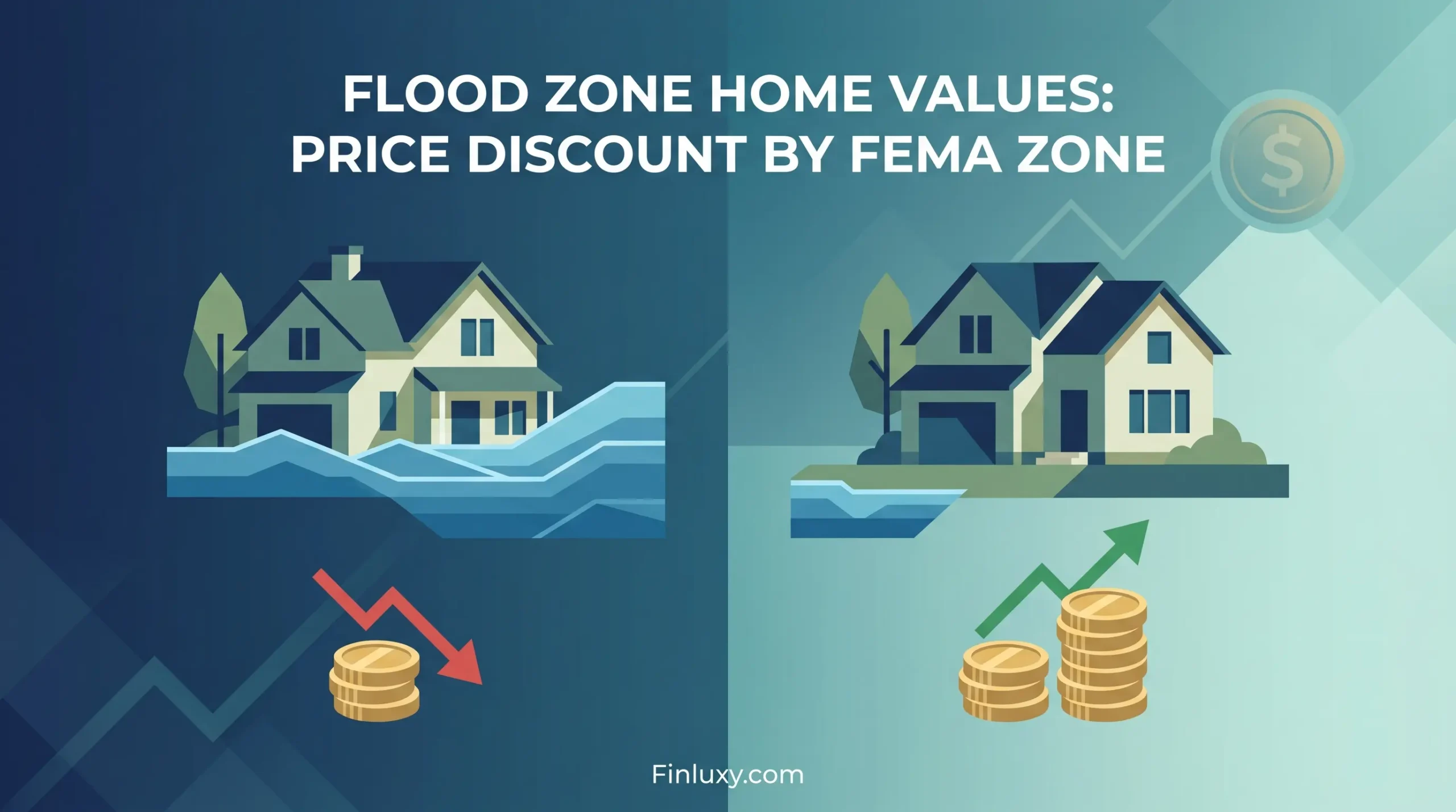
Geometric vector illustration contrasting a flooded house with a price drop against a dry house with rising value.

Flood Zone Home Values: Price Discount by FEMA Zone

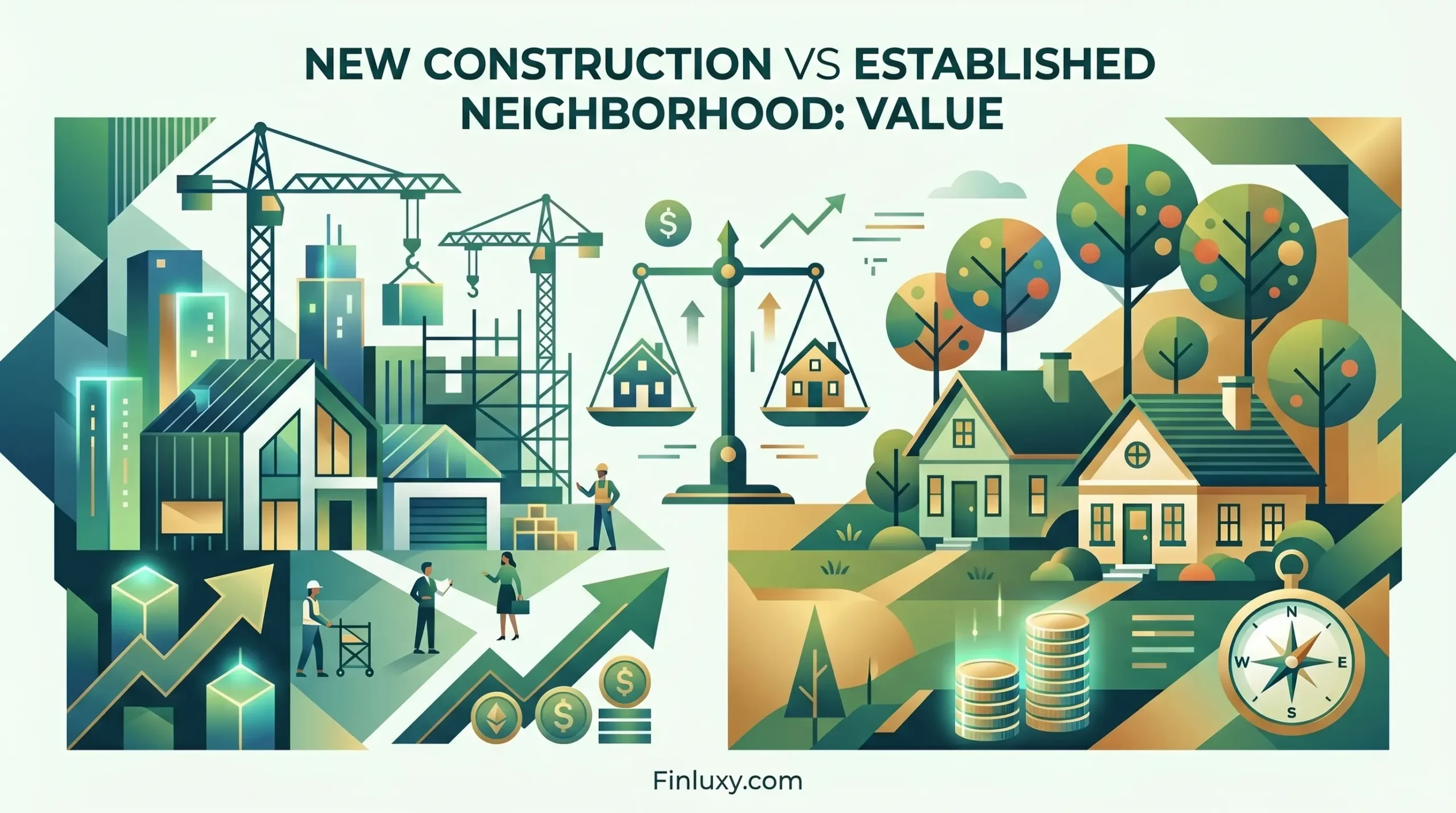
Geometric vector illustration balancing a new house under construction and an established home with mature trees on a scale.

New Construction vs Established Neighborhood: Value

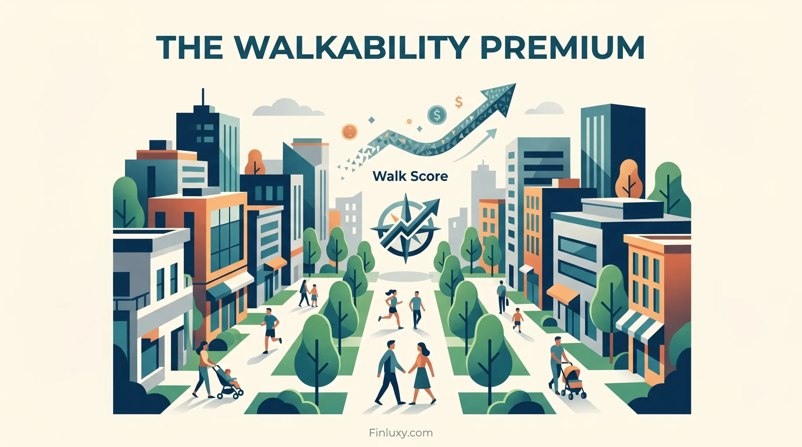
Geometric illustration of pedestrians in a vibrant, walkable neighborhood with subtle financial growth symbols and Finluxy branding.

Walkability Score Premium: How Much Walk Score Adds

A split illustration contrasting a traditional neighborhood with a modern developing one, featuring stylized figures and rising arrows.

Gentrification and Home Values: Risk and Upside

A minimalist vector illustration shows a line connecting a school with an A+ rating to a cluster of homes, with data points and upward arrows.

School Rating Impact on Home Price: Data Analysis

  • About
  • Privacy Policy
  • Editorial Policy
  • Disclaimer
  • Affiliate Disclosure
  • Terms of Use
  • Contact
© 2026 Finluxy. All Rights Reserved.