Skip to content
Finluxy
Finluxy
  • Affluent Living
  • Income Reality
  • Life & Money
  • Luxury Spending
  • Real Estate
  • Smart Spending
  • Tax & Wealth

Salary Check

The most common reason people are underpaid is that they don’t know they’re underpaid. Compensation information has historically been opaque — shared selectively, guarded by employers, and difficult to benchmark accurately from public sources. That opacity has shifted meaningfully in recent years through pay transparency laws in states including California, Colorado, New York, and Washington, and through the expansion of compensation databases that aggregate self-reported salary data. Using these tools correctly is the foundation of any effective compensation strategy.

The most reliable data sources for compensation benchmarking: Levels.fyi for technology roles (particularly software engineering and related positions at major tech companies, where the data is highly granular and regularly updated); LinkedIn Salary for broad role and industry comparisons; Glassdoor for base salary benchmarks by company and location; Radford/Aon and Mercer surveys for HR and compensation professionals at larger companies who can access paywalled professional surveys. Salary.com and PayScale are widely used but tend to run slightly low relative to actual market rates for specialized roles in high-demand fields.

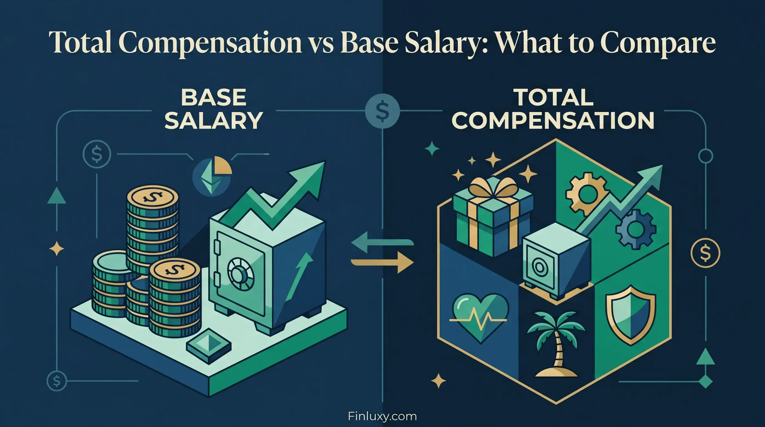
Benchmarking effectively requires being precise about the comparison class. Total compensation — base salary plus bonus plus equity value plus benefits — is the correct unit of comparison, not base salary alone. At technology companies, equity compensation (RSUs or options) can represent 30–100% of total cash compensation, and a base-to-base comparison misses most of the picture. Similarly, a senior role at a Series B startup with significant equity should be benchmarked against late-stage compensation differently than against public company total comp.

Once you have the data, using it effectively in a negotiation requires the framework covered in raise math. For context on how your compensation compares at the level of income and lifestyle, see six-figure life. The Income Reality pillar covers compensation benchmarking as the starting point for all the income optimization strategies that follow.
A modern geometric illustration shows a developer coding, with rising dollar-symbol bars and city skylines representing salary data.

Software Engineer Salary: Percentile Data by City

A geometric vector illustration of a US map with varying bar charts representing median household income levels. "FINLUXY.COM" is at the bottom.

Median Household Income by State: 2026 BLS Data

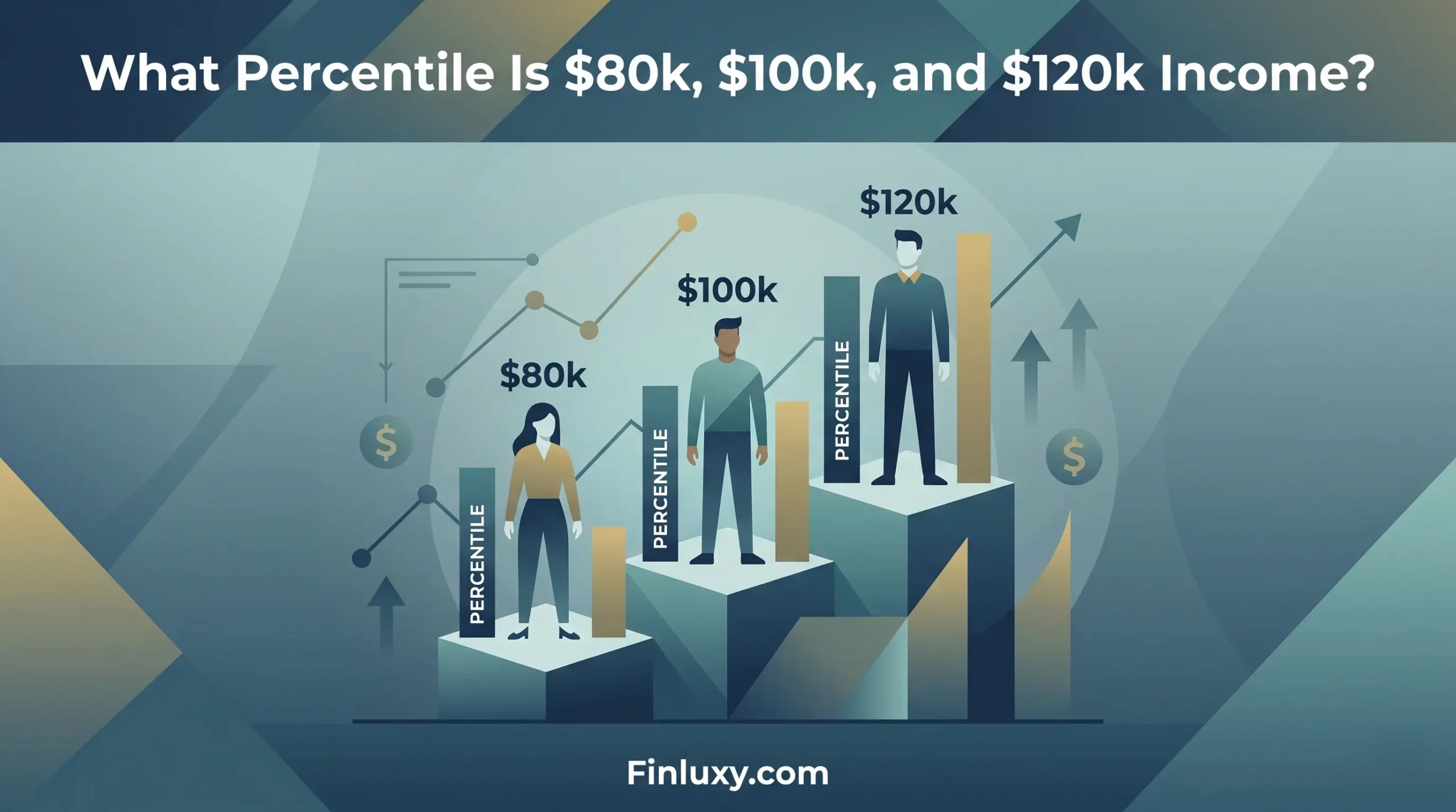
Geometric illustration of three minimalist figures on ascending blocks, representing income tiers, with a premium blue and gold financial theme.

What Percentile Is $80k, $100k, and $120k Income?

Geometric illustration of a figure examining rising salary bar charts with a magnifying glass for Finluxy.com.

Am I Underpaid? How to Read BLS Salary Data

Geometric illustration showing a gap between visual blocks labeled '100k' and '150k' on a progress path.

How Far Is $100k From $150k? The Real Gap in Numbers

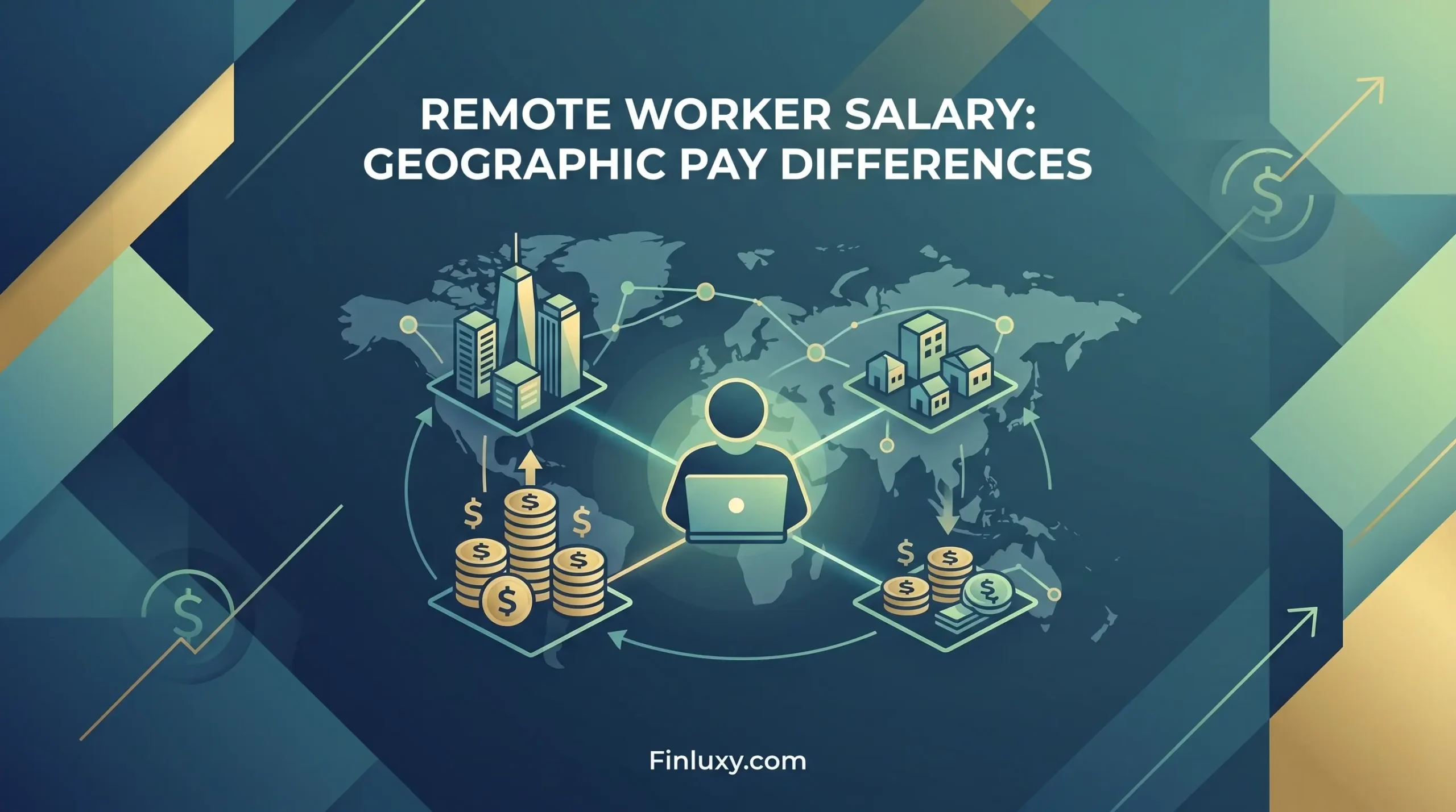
A geometric vector illustration comparing salaries for a remote worker across different global locations.

Remote Worker Salary: Geographic Pay Differences

Geometric illustration depicting diverse professionals alongside rising growth charts, titled "Income Growth by Profession" for Finluxy.com.

Income Growth Rate by Profession: 10-Year BLS Data

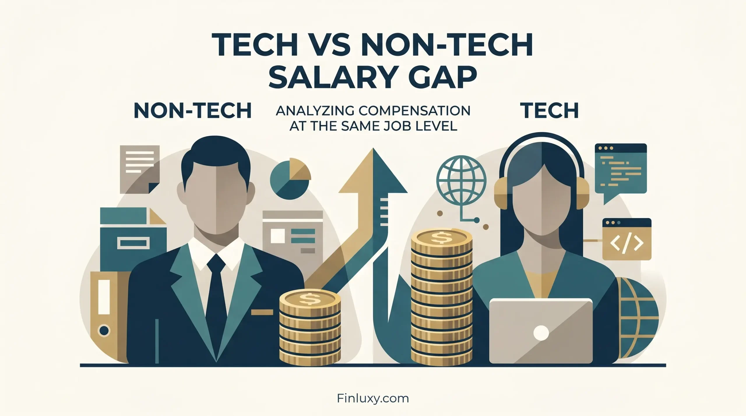
Vector illustration comparing a non-tech professional and a tech professional, showing a significant salary gap through different heights of coin stacks.

Tech Salary vs Non-Tech at Same Level: Gap Data

A modern vector illustration comparing Base Salary on the left with a larger Total Compensation package on the right, showing various employee benefits.

Total Compensation vs Base Salary: What to Compare

Geometric illustration showing ascending gold and teal financial bars and arrows, labeled 'VP AND DIRECTOR SALARY BENCHMARKS BY INDUSTRY' with 'Finluxy.com' at bottom.

VP and Director Salary Benchmarks by Industry

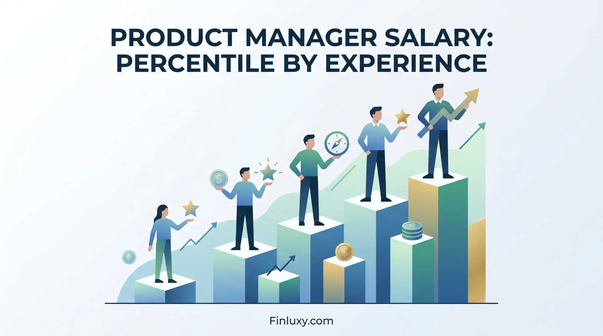
Modern geometric vector illustration depicting an ascending career progression path for product managers with subtle financial elements.

Product Manager Salary: Percentile by Experience

Abstract geometric illustration of a faceless professional climbing steps alongside coins and upward arrows, representing career and salary growth.

Salary Benchmarking Guide for $150k+ Earners

Geometric vector illustration of a businesswoman climbing a rising bar chart, with the text "Marketing Director Salary: Market Rate Data 2026."

Marketing Director Salary: Market Rate Data 2026

Geometric illustration of abstract figures climbing tiered steps with coins, representing consulting career and salary progression.

Consulting Salary by Firm Tier and Level

Geometric illustration of a figure collecting diamonds and certificates in a basket under the headline "Equity as Compensation."

Equity as Compensation: How to Value RSU Grants

Minimalist geometric vector illustration in teal and gold showing upward arrows, with the article title and Finluxy.com website URL.

Finance Salary Benchmarks: $150k to $500k Range

Minimalist geometric illustration featuring the headline "$100k Salary: Is It Still Above Average Currently?" with green and gold rising blocks.

$100k Salary: Is It Still Above Average in 2026?

  • About
  • Privacy Policy
  • Editorial Policy
  • Disclaimer
  • Affiliate Disclosure
  • Terms of Use
  • Contact
© 2026 Finluxy. All Rights Reserved.