Skip to content
Finluxy
Finluxy
  • Affluent Living
  • Income Reality
  • Life & Money
  • Luxury Spending
  • Real Estate
  • Smart Spending
  • Tax & Wealth

Cost Per Use

Cost per use is the single most useful framework for converting purchase decisions from feeling-based to data-driven. The formula is simple: total cost divided by number of uses. A $500 kitchen knife used 300 times per year for 10 years has a cost per use of $0.17. A $50 knife used 20 times and then replaced costs $2.50 per use. The inversion of intuitive “expensive” and “cheap” that this framework produces is its value — it forces specificity about actual usage in a way that sticker price comparisons don’t.

Cost per use is most powerful for the categories where the gap between purchase price and usage is largest. Gym memberships are the canonical example: a $200 monthly membership used 20 times per month costs $10 per visit, which is cheaper than most drop-in rates and represents good value. The same membership used twice per month costs $100 per visit — which reframes the “I should keep it, it’s only $200 a month” logic entirely. The subscription audit framework in subscription audit applies this logic at scale across all recurring costs.

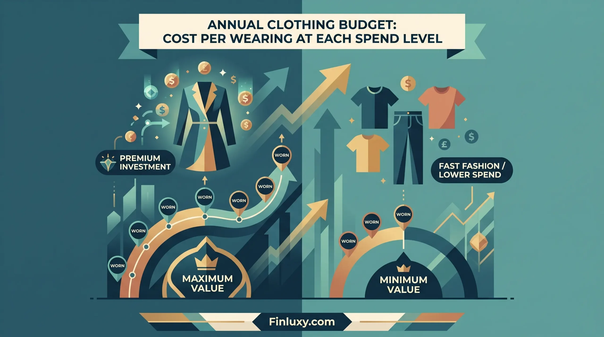
For luxury and high-end purchases, cost per use often produces favorable numbers that justify the spend. A $2,000 blazer worn 100 times costs $20 per wear. A $300 fast-fashion alternative worn five times costs $60 per wear. The more expensive item is 67% cheaper on a per-use basis, which reframes the purchase decision meaningfully. This is the logic behind the “cost per wear” metric widely used in fashion analysis, and it applies equally to tools, equipment, furniture, and any durable good.

Cost per use is less useful for infrequent purchases where usage is inherently limited — a wedding dress will always have a high cost per use, and that’s expected. It’s most valuable for recurring purchases and membership costs where the usage assumption at purchase time is frequently optimistic. For the broader framework of evaluating whether a purchase is worth making at all, see worth it? The Smart Spending pillar covers cost per use alongside all the other analytical tools for intentional spending.


Modern geometric illustration of a fractured efficiency symbol under the headline "Purchases That Look Efficient But Aren't."

Purchases That Look Efficient But Aren’t

Modern geometric illustration of a luxury watch paired with abstract financial symbols in navy and gold.

Rolex Over 10 Years: Daily Cost of Ownership

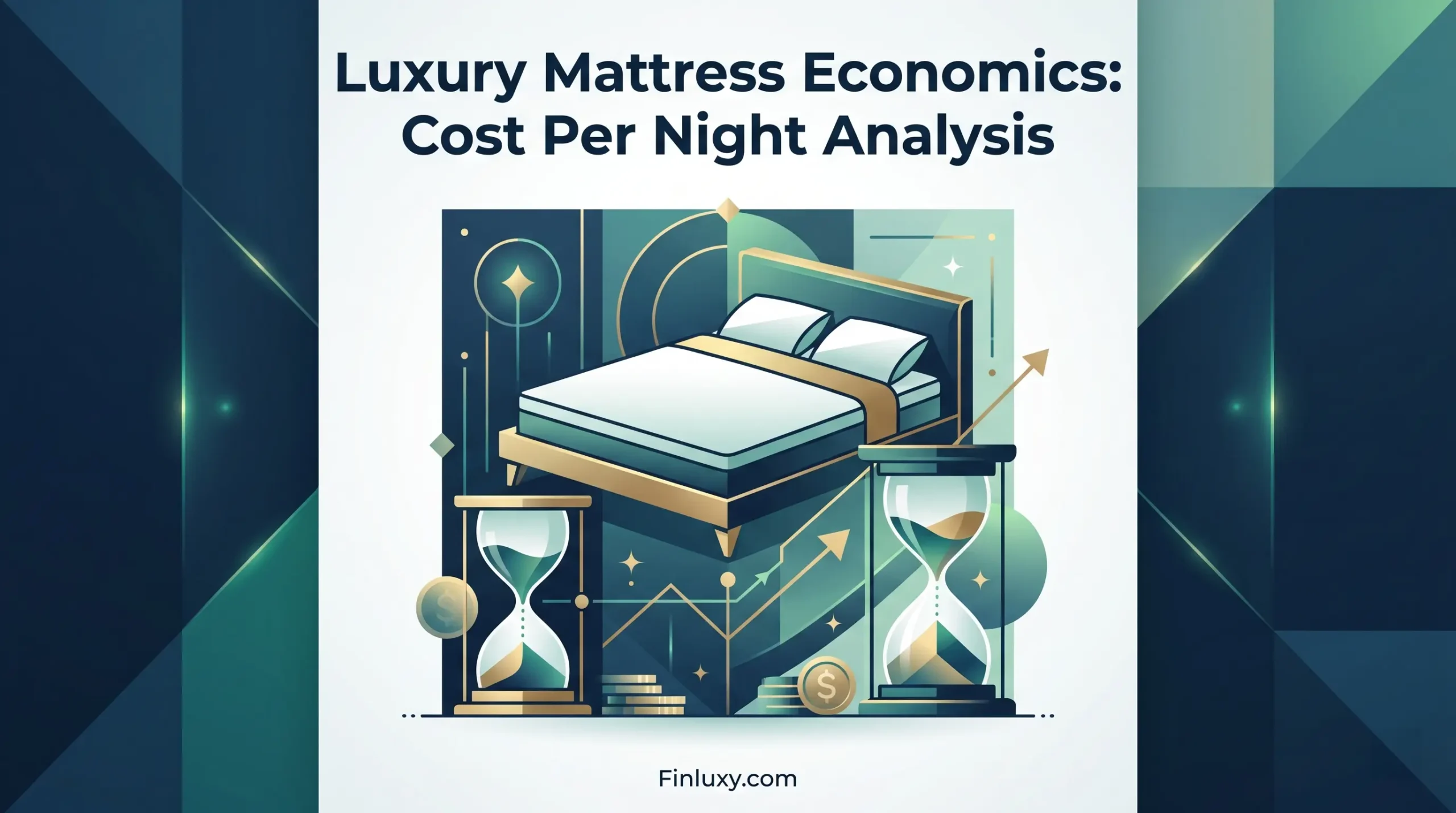
Modern vector art showing a luxury bed alongside hourglasses and coins, illustrating the long-term value of sleep investments.

Luxury Mattress Economics: Cost Per Night Analysis

Isometric illustration comparing costs of private school versus public school with added enrichment activities.

Private School vs Public Plus Enrichment: Per Year

A geometric illustration comparing the cost per session of a physical personal trainer with digital platform fitness apps.

Personal Trainer vs Digital Platform: Cost Per Session

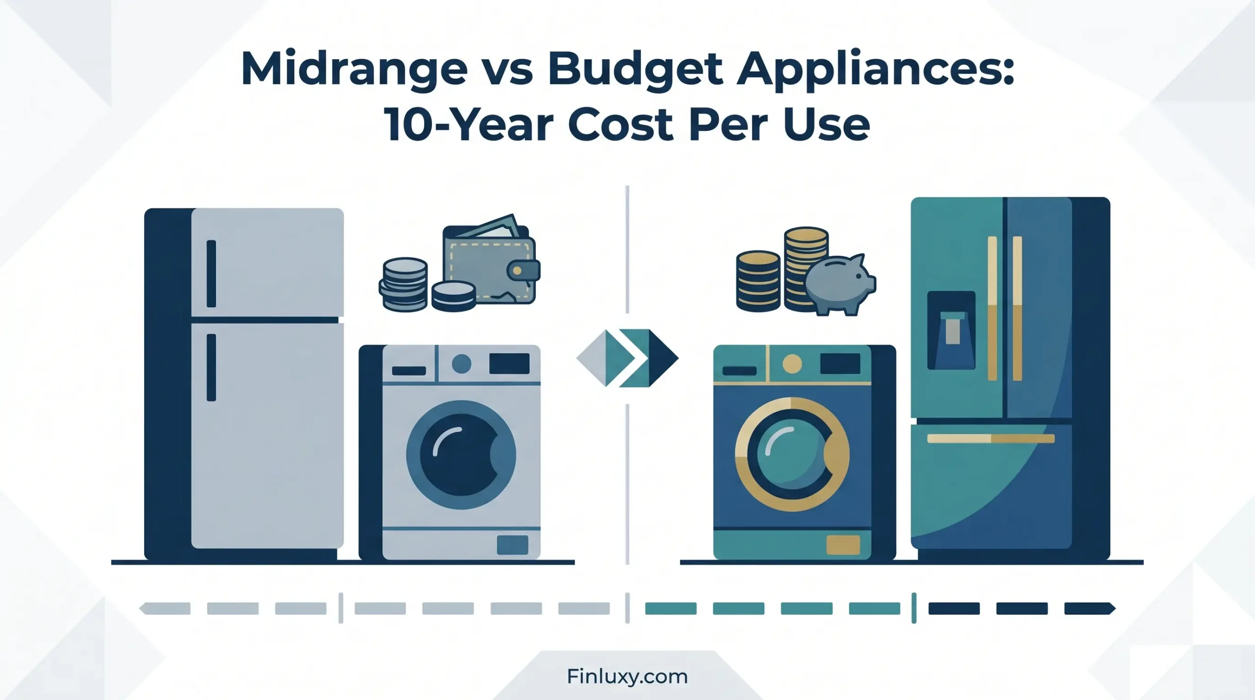
A clean geometric illustration comparing budget and midrange appliances for Finluxy.com, showing potential long-term savings.

Midrange vs Budget Appliances: 10-Year Cost Per Use

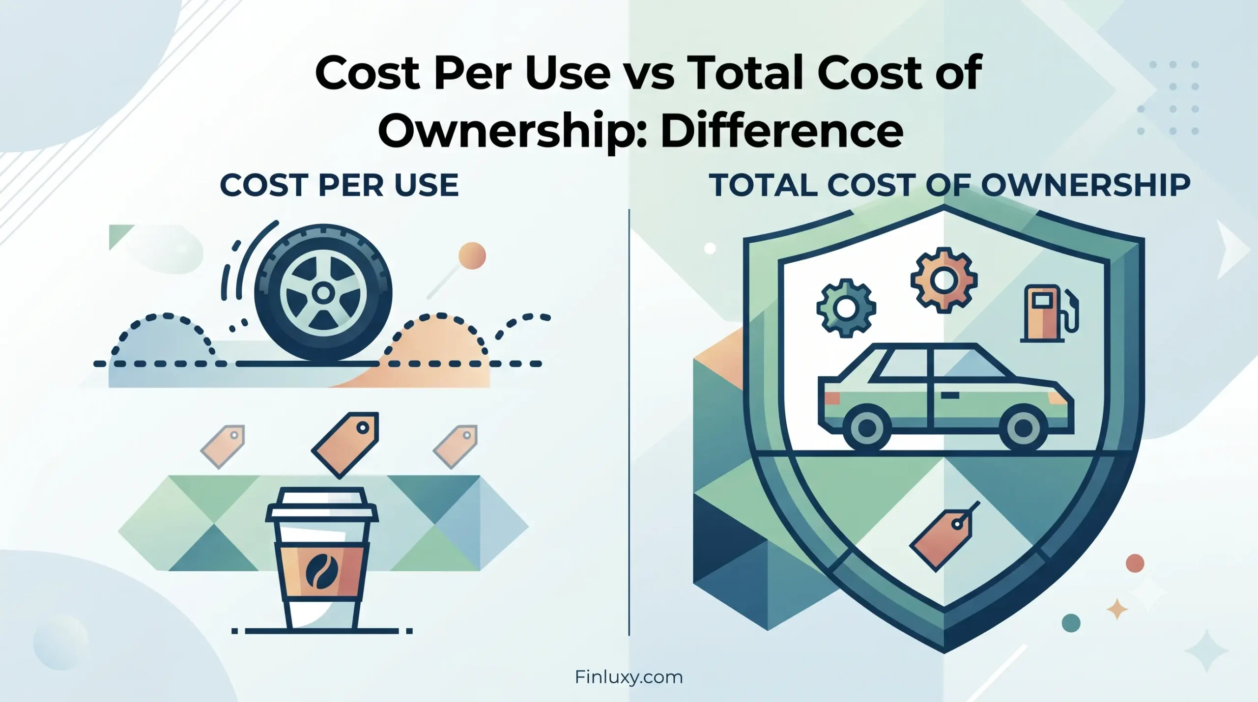
A geometric vector infographic comparing 'Cost Per Use' with daily items to 'Total Cost of Ownership' featuring a car within a shield.

Cost Per Use vs Total Cost of Ownership: Difference

Geometric vector illustration comparing home Peloton use with a gym workout for a three-year cost analysis, with Finluxy.com branding.

Peloton vs Gym Membership: 3-Year Cost Per Use

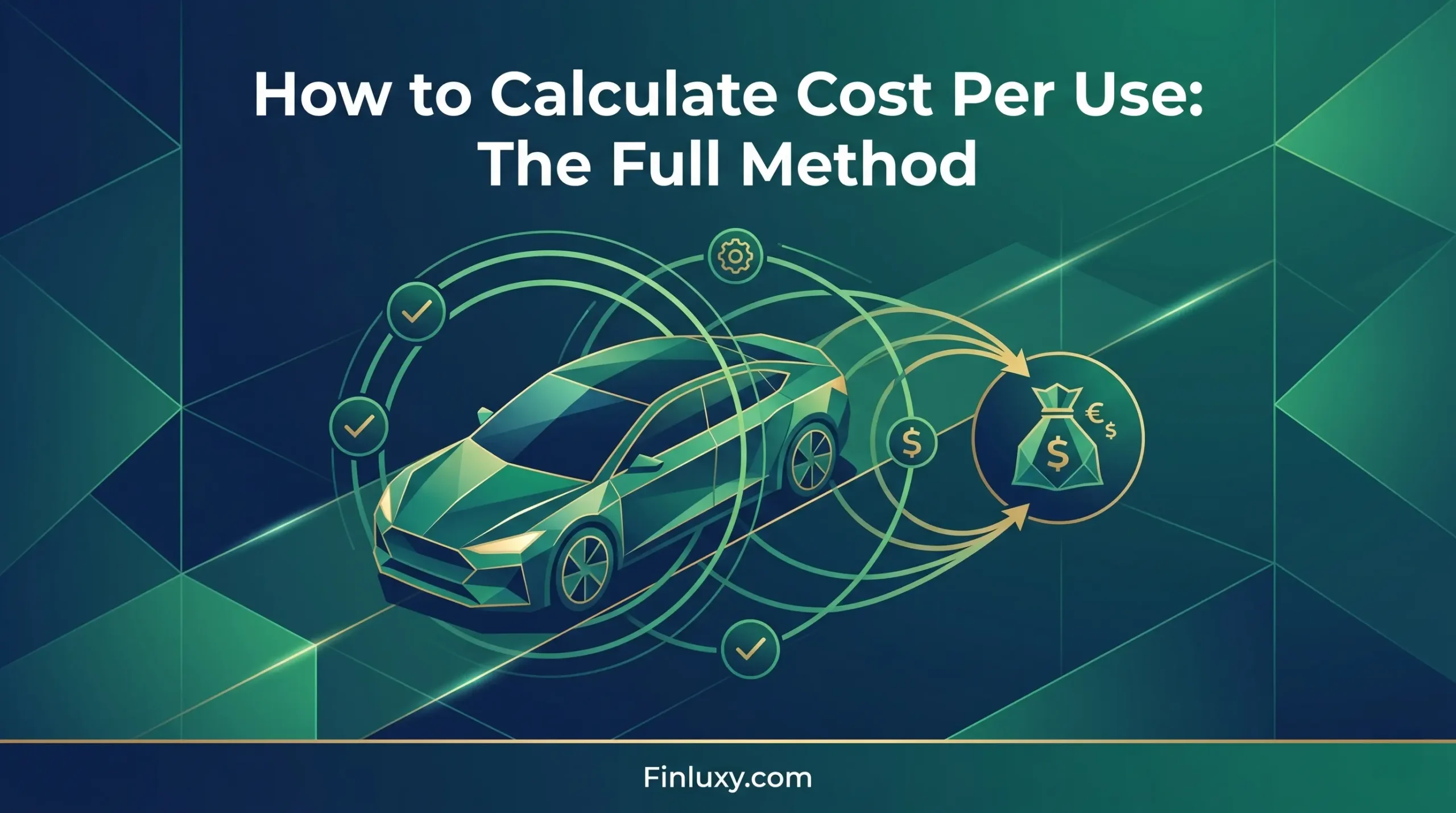
Geometric vector illustration visualizing a car with circular usage lines and a money bag, titled "How to Calculate Cost Per Use".

How to Calculate Cost Per Use: The Full Method

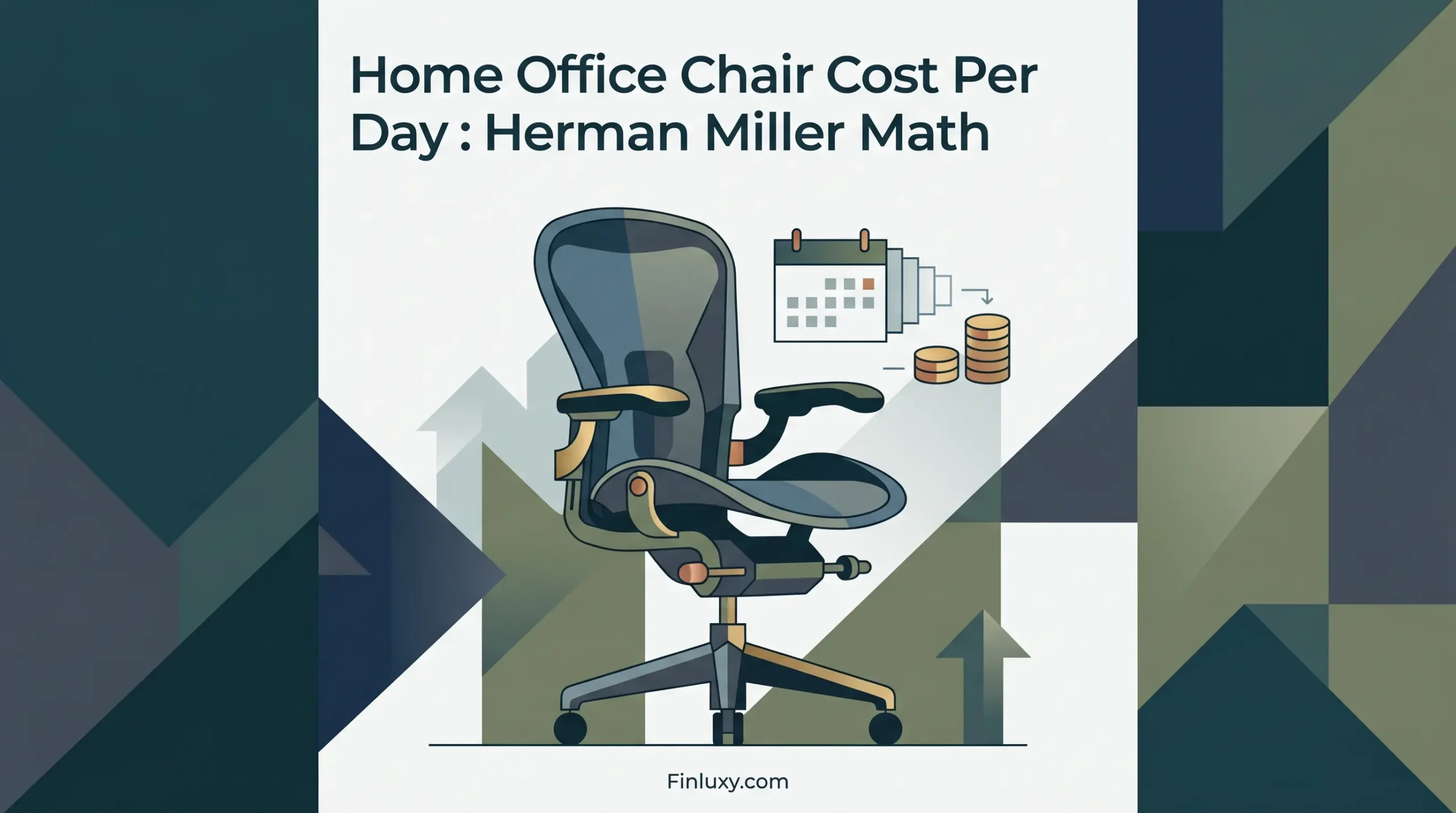
A geometric vector illustration shows an ergonomic office chair, a calendar, and coins, visualizing home office chair cost calculations.

Home Office Chair Cost Per Day: Herman Miller Math

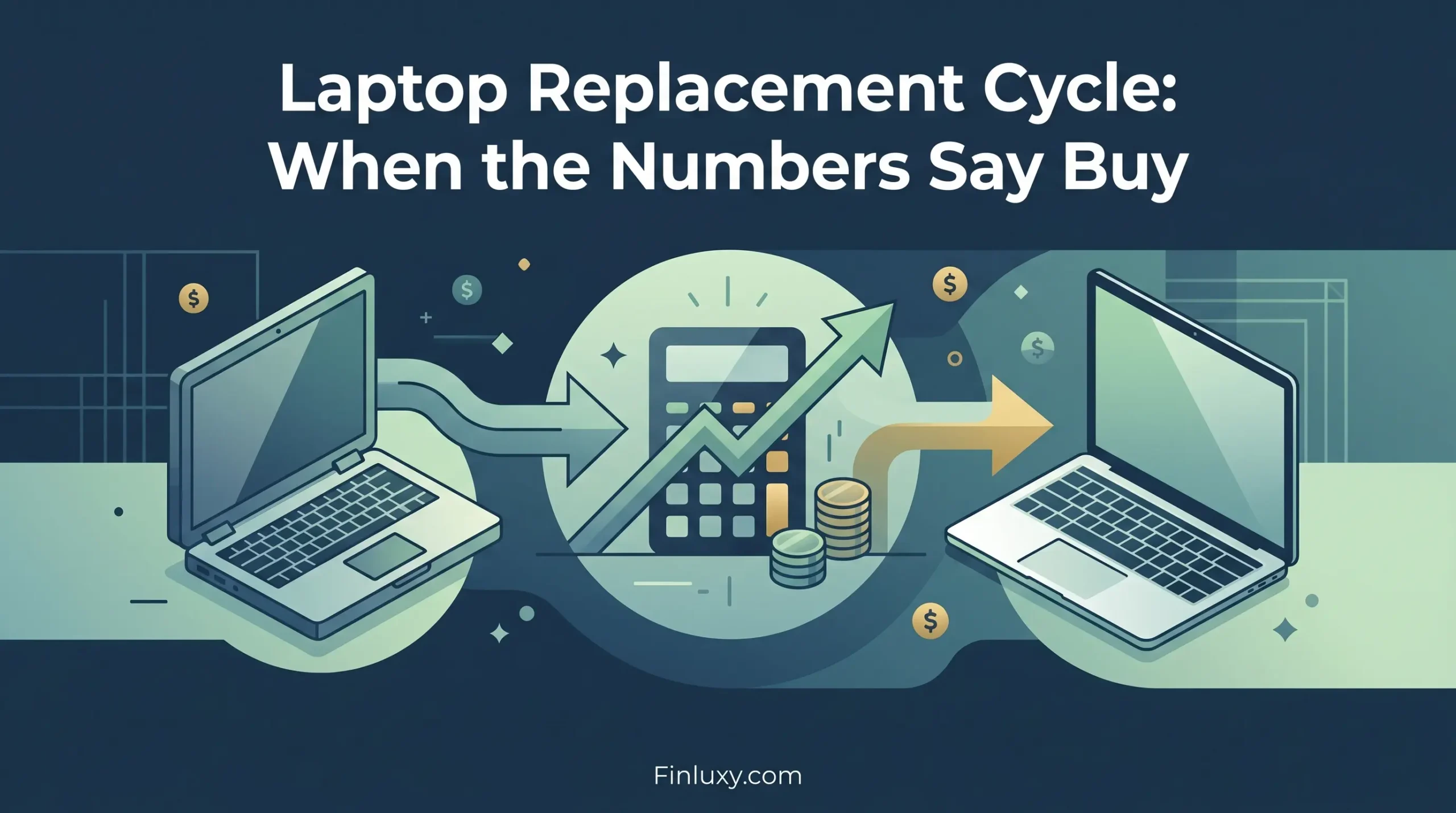
Geometric vector illustration showing a laptop replacement cycle with a calculator, coins, and growth arrows in a modern financial style.

Laptop Replacement Cycle: When the Numbers Say Buy

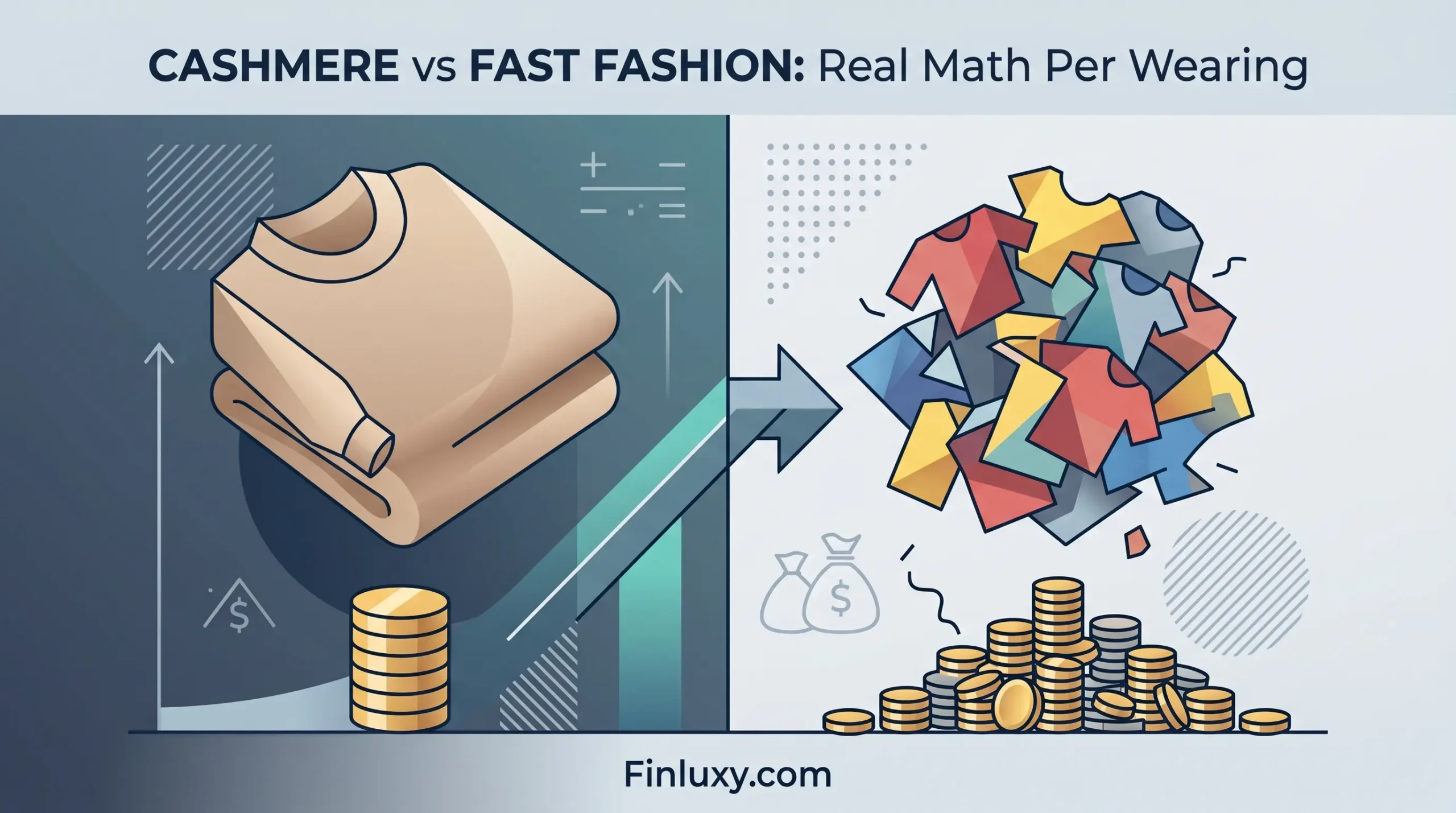
A modern geometric illustration comparing a high-quality cashmere sweater to a messy pile of multiple fast-fashion shirts.

Cashmere vs Fast Fashion: Real Math Per Wearing

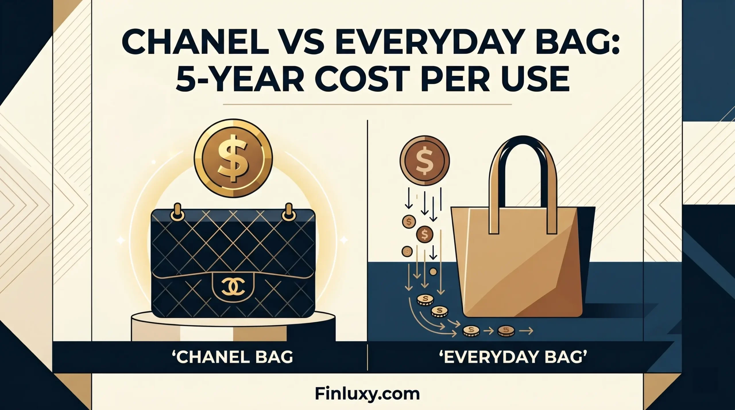
A modern vector comparison graphic comparing a luxury black handbag and a simple brown tote bag for cost per use.

Chanel vs Everyday Bag: 5-Year Cost Per Use

A geometric vector illustration comparing the value of 'Premium Investment' clothing versus 'Fast Fashion' over time.

Annual Clothing Budget: Cost Per Wearing at Each Spend Level

Geometric vector illustration for Finluxy.com, featuring a vacation home and currency symbols.

Vacation Property: Annual Cost Per Night Stayed

A vector illustration comparing two generic cars and their associated maintenance costs.

Toyota vs Honda: 5-Year True Ownership Cost Compared

Geometric split-screen illustration comparing two running shoes positioned over winding paths and abstract currency symbols.

Running Shoes at $80 vs $180: Miles Per Dollar Analysis

Geometric illustration comparing usage cost of Sony, Bose, and B&O headphones with stacks of money and clock gears.

Premium Headphones Cost Per Hour: Sony vs Bose vs B&O

A vector illustration of a man relaxing in a luxurious first-class airplane seat, with financial symbols floating nearby.

First Class: When It Is Actually the Rational Choice

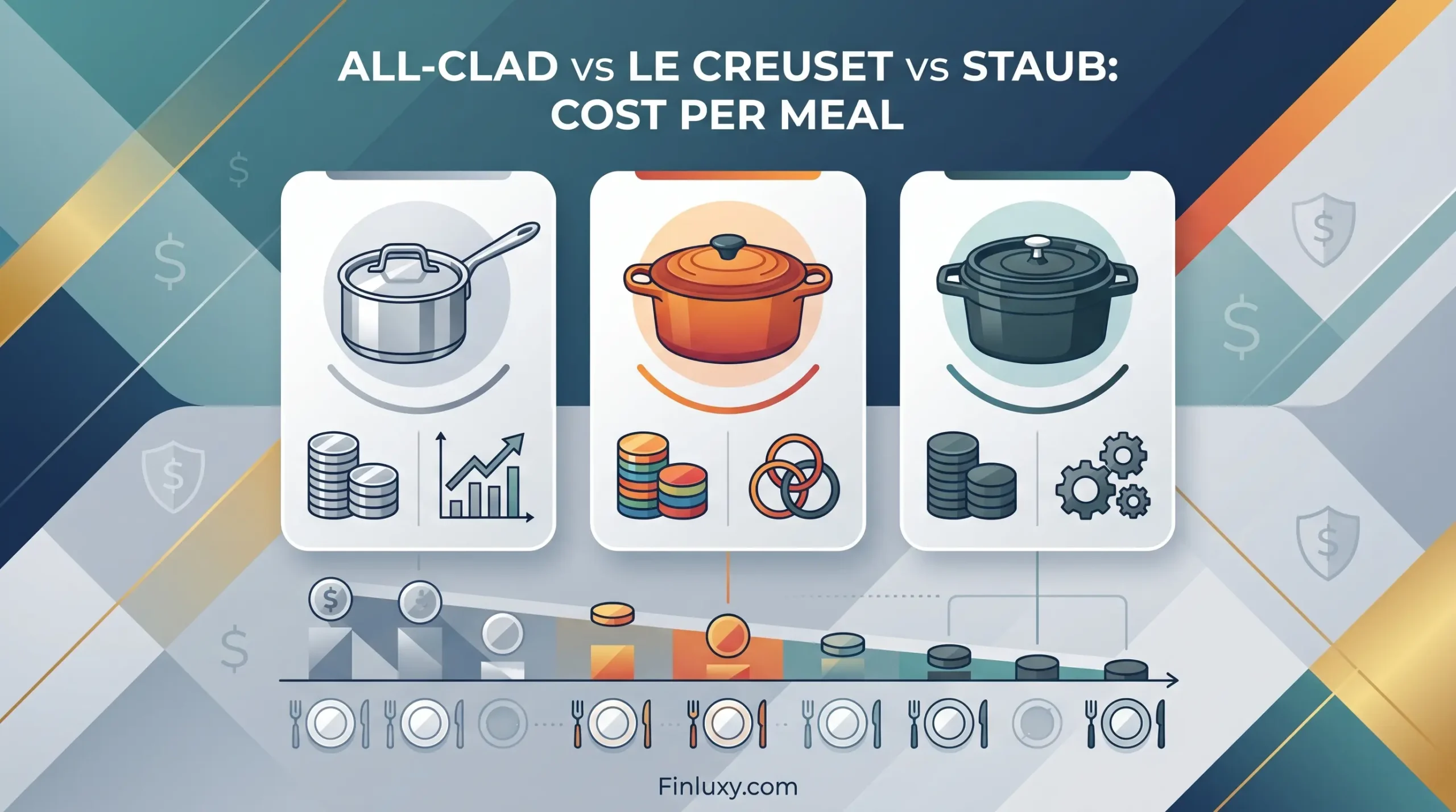
A minimalist geometric illustration comparing three premium cookware pots alongside abstract financial elements analyzing meal costs.

All-Clad vs Le Creuset vs Staub: Cost Per Meal

Geometric vector graphic of a wine fridge and espresso machine with rising arrows and coins, for Finluxy.

Wine Fridge and Espresso Machine: Do They Earn Their Place?

  • About
  • Privacy Policy
  • Editorial Policy
  • Disclaimer
  • Affiliate Disclosure
  • Terms of Use
  • Contact
© 2026 Finluxy. All Rights Reserved.